Tuesday, November 24, 2009
New culture in the Ad.
DGCers always sing this song. You see Chan fly is the main actress in this advertisement!! This ad give me a warm feeling, everyone in the ad sings the same song, and the lyrics are also meaningful that spread a msg that Vitasoy would stand by you always. Apart from this ad, I observe that nowadays many ad have songs in it, like the following:
Will this culture carry on to appear in the ad???
Game Over VS 7 Things
G.E.M - Game Over
Miley Cyrus - 7 Things
In the forum, many people blame that G.E.M's new music video is copying from the music video of Miley Cyrus published last year. After watching both MV, there are really some similarities between the 2 music video, but I think many music videos in the world are like this. The similarities may be a coincident!
But why the people blame G.E.M? The music video was not directed by her definitely. This is quite unfair to this little girl.
P.S.
Fake '7 Things'....laughable!!
Japanese CD cover~
I think the package and cover of the Japanese CD are very beautiful. The music company in Japan really pay great effort and attention in doing that. And I want to share with u some of them. Mr Children - GIFT
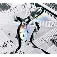 Mr Children - GIFT
 Aqua Timez - しおり
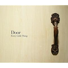 Every Little Thing - Door
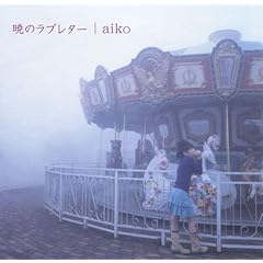 aiko - 暁のラブレター
 コブクロ - STAY
From my observation, many of the cover of Japanese CD do not have great focus on the singer, instead, the designer would try to use many other things to express the meaning of the song or the theme of that album. That's what I appreciate much!! In Hong Kong, I think many music company are not serious with the art production of an album, they just take few photos of the artist and then choose one to be the cover. However, no message can be spread from it. I really hope Hong Kong music company can learn more from the Japanese music company.
Normal Lady Gaga VS Lady Gaga
Normal Lady Gaga
Lady Gaga
Which one do you like? Actually, I have a question that if the image of lady gaga is not that exaggerative and horrible, can she stand out from the crowd? Would people take attention to her and her music? But it's true that Lady Gaga has her actual strength, and it's not necessary for her to be like this. Like Norah Jones, she also doesn't have very exaggerative image, but her music can still attract many people!
So, I really look forward to seeing her to return to normal. Will she have this chance?????
This is the the promotion card of the external-play of the dramatic society.

 On the card, there are traditional Hong Kong architecture and things like the old bus, the Chinese boat and the Chinese traditional calculator. On the back of the card, you can see there are flowers on the up right and down left positions. And you can usually see this type of flower on the traditional chinese poster. In fact the words on the card are also quite unclear but still readable.
So the card give the audience a local vintage feeling. And if you can also feel it, I think somehow the design is successful. Cuz this play is really about old things, the collective memory of us. Thus, the designer of this card try to express an old, traditional feeling to the audiences, to let them know more about the theme of the play.
P.S. I am the props team of this play and we have found and made many old things for this play, so plz come and support us!!!!!!
Dream eater
This Japanese song is called 'Yumekui" which means Dream eater. Of cuz, this song is about dream. The promotional video of this song is really nice to watch. Actually, it is a short animation. In the PV, you see a boy and other people have dream growing from their heads, and the dream eater will eat their dream, once the dream is eaten, their dream would come true. When you look at the lyrics and the PV at the same time, you will feel that they are really matched, and the PV can really bring you into the song, and the song can also bring you into the story of the PV. That's the magic of the PV!!!A good PV/MV should have this function.
And I also love the 2D style animation very much, because of the vintage feeling !!!!!I really hope I can do this in the future.
P.S. When you watch the animation, at the same time, please look at the English lyrics, Cuz they are related!!
An impressive design~
This is the brochure of the internal play!
 Front side
 Back side
 Phrase: BU Dramatic Society!!!!!
 Cards about the play
This night, I went to watch the internal-play of Dramatic Society and received this brochure. I am really appreciate with this. It is very beautiful and I found that the design of it is quite special, and there is something that I can learn from. You see there are few lines of Chinese words on the back cover, when you try to read it, you definitely cannot read out a complete meaningful sentence as the words are not arranged appropriately. But when you use the ticket to cover it, you will see 4 words meaningful phrases appearing. This design really impress me and I can feel the heart of promote team. They are very creative!!! Normally, when I receive some free souvenirs which is attractive and special, I will keep it. And this brochure should be the one~
My Visual lexicon!
This is my visual lexicon.


When I start to think of what topic I should focus on, My brain sucks!! I cannot think of any. But during a dinner with my family, my sister really inspired me, I remember that time my sister said 'Your topic(things about secondary students) is really boring and dull, you should do something like the nickname between a couple!' Of course, I didn't stick on the recommended topic, but my sister made me thinking of another one, that's the nickname used by HongKongers. Actually, these nicknames are all very thrilling have certain meaning for us. Thus, I think this lexicon can really reflect some of our local culture.Interestingly, when I posted these photos to my facebook, some of my friends tag some others on the lexicon...ahhh...It's really funny!!
P.S. I really hope professor can give me back the lexicon, cuz I really love it!!
Monday, November 23, 2009
Self Design Ancestor!!
 This is one of my typography assignment of DGC1190, the title is the delight, anger, unhappiness and happiness of a joker.
The first ancestor:
 I search 'Joker' in the yahoo searching engine, and find the photos of the joker, so that I can follow the picture in Adobe Illustrator to draw the face of joker by using different types. Thus, as you see my picture of joker is more or less the same as this photo of joker.
The Second ancestor:
 In fact the design of the whole picture is inspired by Andy Warhol's pop art and his art work. Actually, my artwork is very similar to this art piece. In this art piece, there are 9 images of Marilyn Monroe in different colour. In my artwork, the 4 jokers are also in 4 different color, delight, anger, unhappiness and happiness are represented by yellow, orange, blue and pink these four colour.
3 most 'memoriable' CD cover
 Miriam Yeung - Actually I am happy
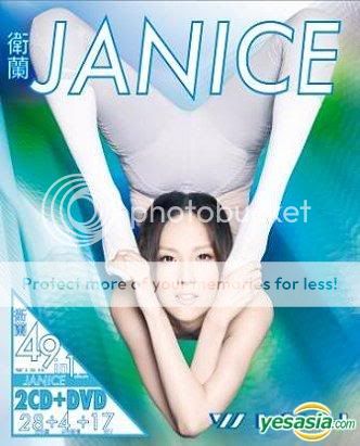 Janice - Wish
 Aarif Lee - Start from totay
These 3 CD are published during the same period of time, the music style of three singers are different, but their CD cover have similarity. They are similar that they are not attractive and even ugly. For the first CD cover (Miriam Yeung - Actually I am happy), the style of the cover is very 'old-school', when I look at it, I feel I am going back to the 80s, moreover, the album title is about happy, but Miriam doesn't smile in the cover and even show an unhappy face, the photo used is really not suitable to be the cover. For the second CD cover (Janice - Wish49), when I looked at it, I laughed. Janice does yoga in the cover, no matter how hard it is, it is not beautiful and doesn't appreciate me! And again, what is the relationship between wish and yoga? Why does she need to show her great yoga skills in the cover? For the third CD cover (Aarif Lee - Start from today), I saw comments from a lot of people in a forum that they thought the CD cover was just like the cover of gay magazine. And I can't comment on the comments of them cuz I am not familiar with it.
But I want to say a CD cover is really important to a CD, cuz it is the first impression to the people, thus the cover should be attractive and meaningful to draw the attention of the people in the CD shops. Interestingly, the 3 CD are published by the same Music company, I think they should pay more attention on the art design of an album.
But I want to say a CD cover is really important to a CD, cuz it is the first impression to the people, thus the cover should be attractive and meaningful to draw the attention of the people in the CD shops. Interestingly, the 3 CD are published by the same Music company, I think they should pay more attention on the art design of an album.
Are they too similar?
These two promotional video have very similar shooting style. In both PV, there are many people with the same faces. They are actually different shoots of a motion. However, for the first PV (Ai Otsuka- Rocket Sneakers), one people do all the shoots, but for another one, there are almost 50 people doing different shoots. Thus, when you you watch the 2 PV, u will definitely think that the second one is more playful. Certainly, I love the second one more! But there is a question here, are they too similar? And do you know which PV was published earlier?
Subscribe to:
Comments (Atom)